

The project
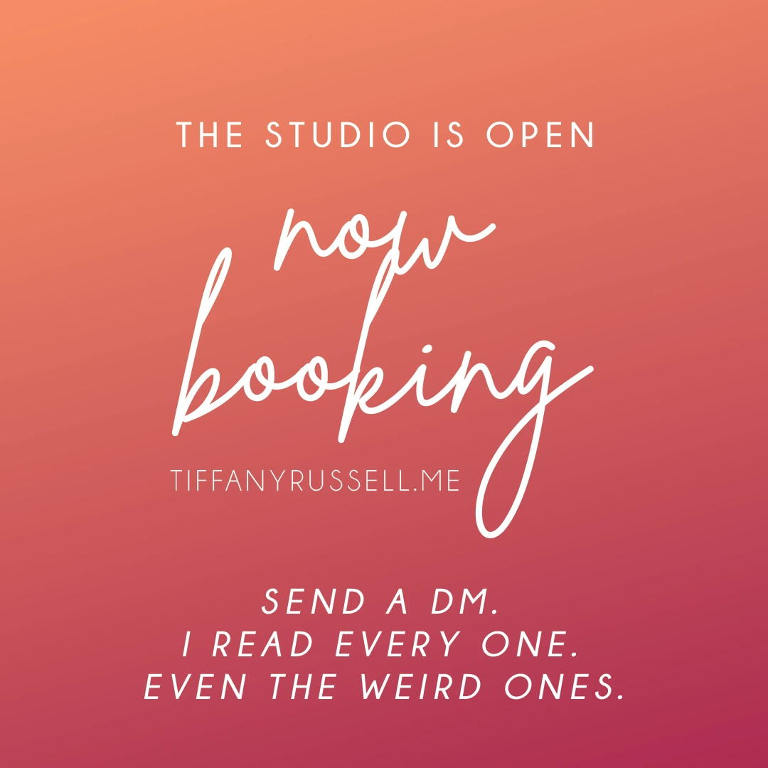
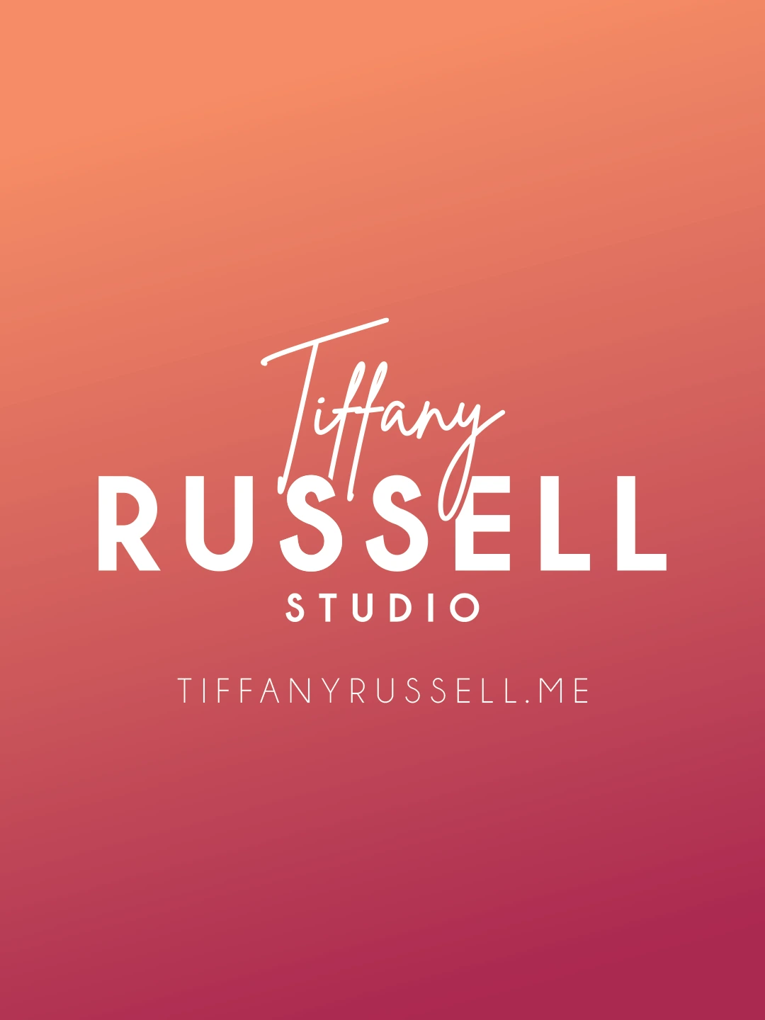
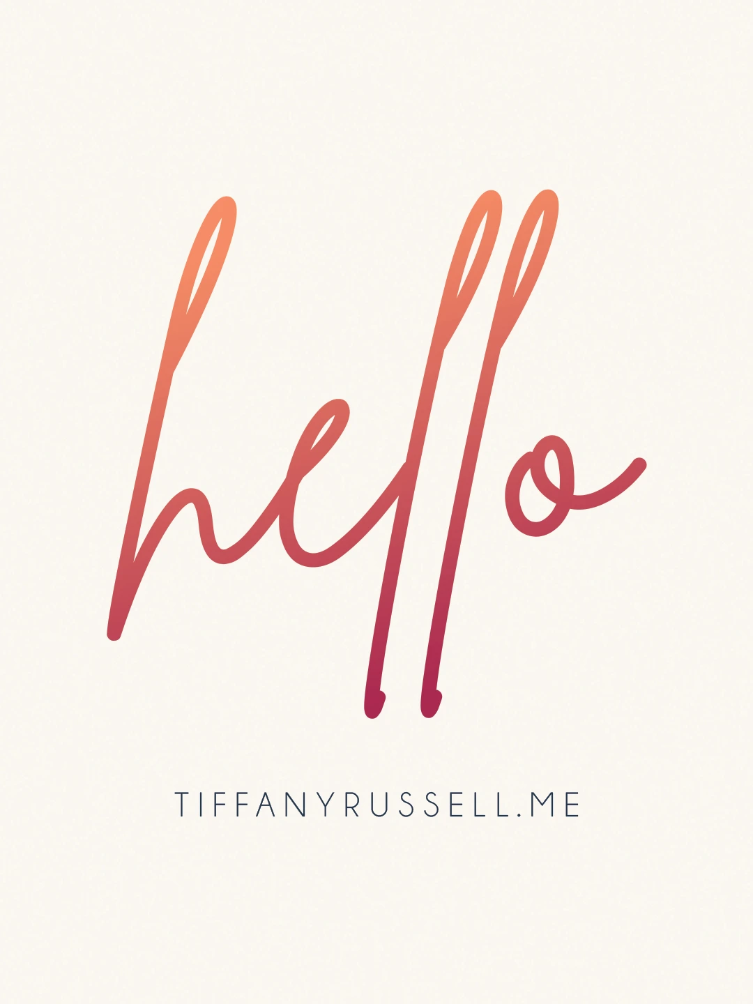
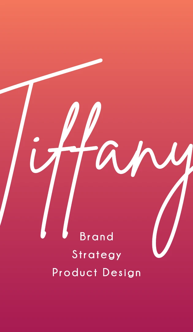
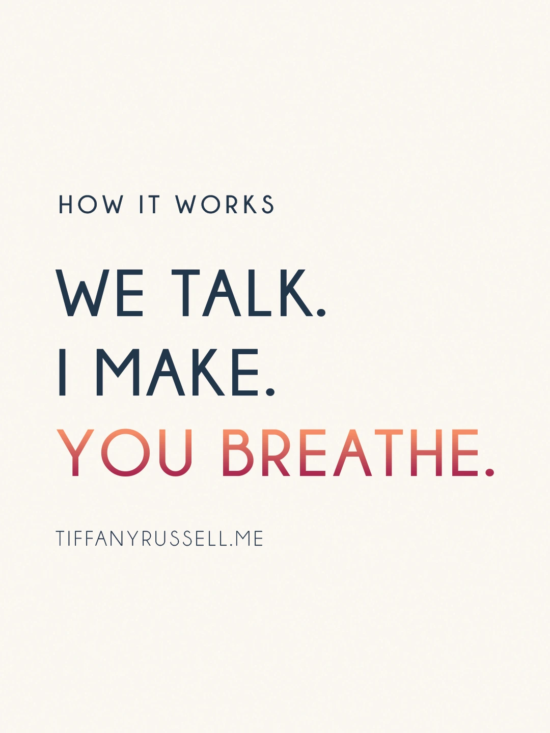
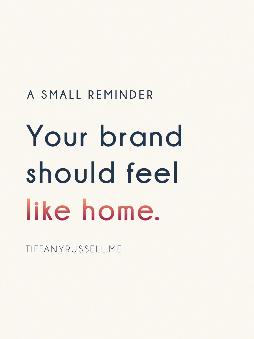
Most designers have a cobbled-together personal brand that never quite fits. I didn't want that. When I launched Tiffany Russell Studio, I treated myself like a client — full brief, real positioning, no shortcuts. The result is a brand that actually reflects how I work: warm but precise, confident without being loud, a little editorial. The coral-to-rose gradient in the script wordmark is the thread that runs through everything — from the logo to the business card back to the social presence.


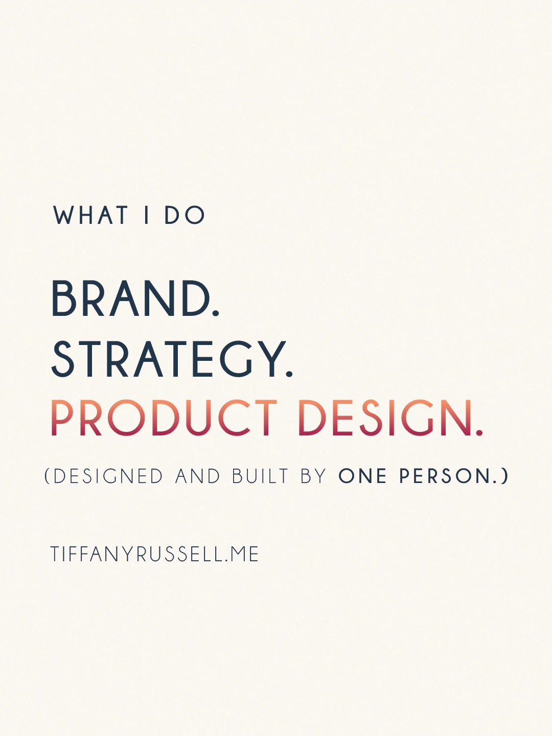
How I helped
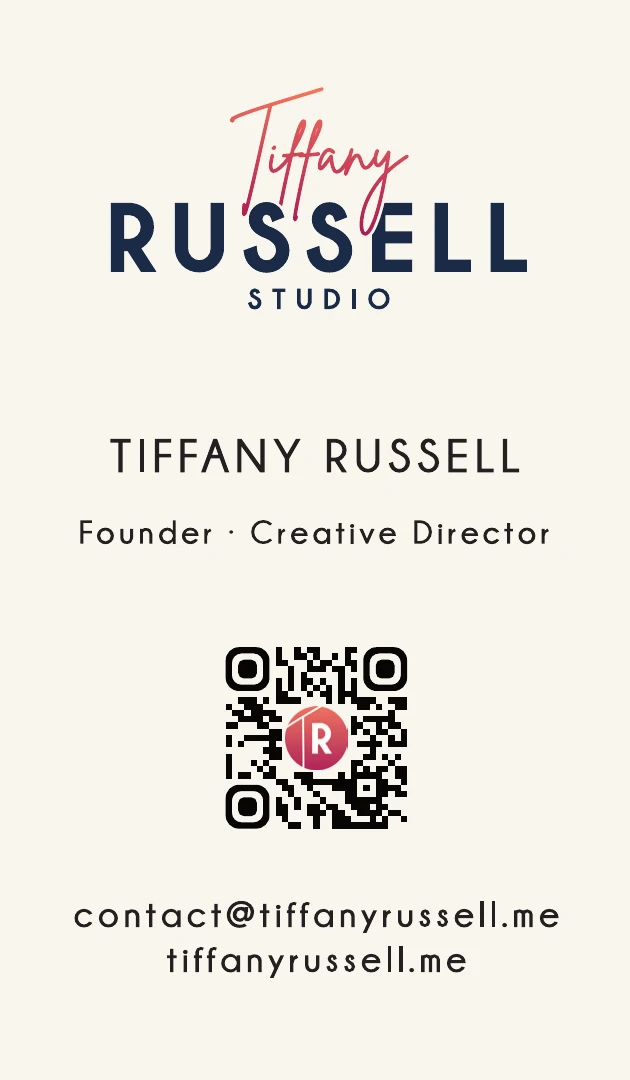
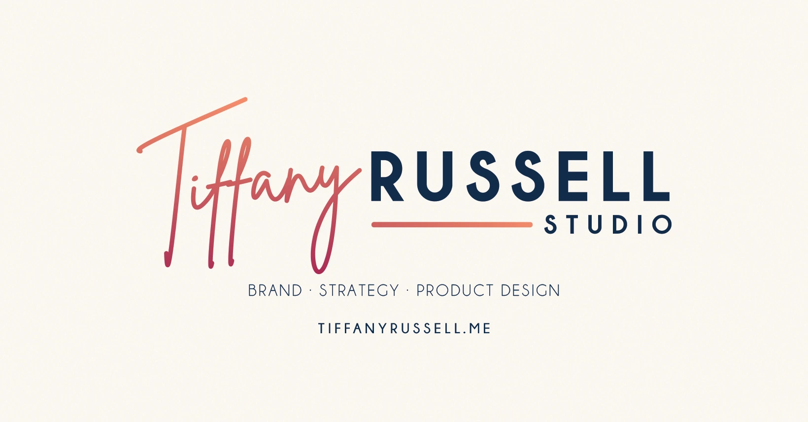
- Full logo system: primary stacked, horizontal, all-white, and TR circle monogram variants
- Typography pairing: coral script wordmark over navy bold condensed sans — editorial and personal
- Coral-to-rose gradient as the signature brand element, used as accent across all touchpoints
- Two-sided vertical business card: clean credential front, full-bleed gradient back
- Color and type system documented for consistency across web, print, and social